1 Web dev math fundamentals
This chapter highlights how a small amount of practical math quietly powers everyday front-end work. From CSS relative units like em and rem, to animation easing such as ease-in-out, to JavaScript geometry via getBoundingClientRect(), understanding the math behind these tools leads to more precise, robust, and responsive interfaces—without needing advanced mathematics.
- Recognize where math appears in CSS and JavaScript (relative units, easing curves, element sizing and positioning).
- Appreciate the benefits: tighter layout precision, smoother animations, and predictable behavior across devices.
- Focus on practical, problem-solving math rather than abstract theory.
- Review just the essential concepts needed to improve everyday design and development decisions.
By the end of this foundation, a light math toolkit helps you make designs more exact, animations smoother, and layouts more responsive.
1.1 Why bother learning about front-end math
Front-end math equips designers and developers with a practical toolkit for precision, performance, creativity, and professional growth. It replaces guesswork with clear logic, making layouts and interactions more reliable and maintainable.
- Build precise, reliable layouts: Understand spacing, alignment, and sizing so you can diagnose and prevent layout breakage instead of trial-and-error tweaks.
- Master responsive design faster: Use proportions, percentages, viewport units, and functions like clamp() to create fluid, constraint-aware designs that adapt predictably.
- Write smarter, faster code: Implement animations and dynamic layouts with your own lightweight calculations, reducing dependency on heavy libraries and improving performance.
- Debug with confidence: Spot issues rooted in units, percentages, and transitions, fixing “almost aligned” or “almost smooth” results with precision.
- Unlock creative possibilities: Build circular and spiral layouts, rhythmic typography, and ratio-driven grids (e.g., Golden Ratio) by leveraging mathematical patterns.
- Level up professional value: Bridge visual creativity and technical logic, explaining not just how something works but why, which sets you apart.
The takeaway: math puts you in control of your designs and code—and that control is central to effective web development.
1.2 Why math matters in front-end development
Math quietly powers everyday front-end work—from typography and layout to animations and interactivity. Recognizing the patterns behind sizing, spacing, and scaling helps explain confusing behaviors (like unexpected font sizes due to inheritance and unit choices) and leads to more confident, creative decisions.
1.2.1 The connection between mathematics and web design
Design fundamentals—balance, proportion, rhythm, and structure—are rooted in math. Concepts such as the rule of thirds, the Golden Ratio, and modular type scales guide harmonious layouts and typography. Even routine choices like setting max-widths or centering elements are mathematical decisions, whether explicit or intuitive.
1.2.2 Real-world examples of math in UI/UX
- Responsive layouts: Percentages, viewport units, and calc() scale content fluidly across screens.
- Typography: Ratio-based type scales maintain visual rhythm and hierarchy.
- Color: Brightness, contrast, and blending rely on numeric manipulation of color values.
- Spacing and alignment: Grid systems use consistent units, columns, and gutters—applied arithmetic.
- Motion and animation: Timing functions, easing curves, and velocities shape natural-feeling transitions.
User input (scroll position, cursor movement) becomes live numeric data that drives dynamic, accessible, and readable interfaces.
1.2.3 How developers use math in animations, layouts, and interactions
- Animations: requestAnimationFrame() and easing functions compute positions over time using speed, time, and curves.
- Layouts: Grid and Flexbox rely on ratios, fractions, and proportional scaling to balance columns and widths.
- Interactions: Measuring drag distance, angles, and thresholds (e.g., Pythagorean distance) informs UI behavior.
Understanding the underlying math improves structure, flow, and behavior—not by memorizing formulas, but by recognizing patterns and applying them effectively. The next section explores how CSS and JavaScript each handle math differently and how to use their strengths together.
1.3 The role of mathematics in CSS and JavaScript
Math in front-end development isn’t a single tool—it’s a set of approaches built into both CSS and JavaScript. Knowing when to use each helps you pick the right tool for layout, responsiveness, interaction, and real-time behavior.
1.3.1 How CSS uses math
- Position elements: Centering and alignment rely on calculations based on the box model and parent-child relationships.
- Scale layouts: Relative units like %, vw, and em compute sizes from context (viewport, font size, container).
- Create responsive designs: Functions such as calc(), clamp(), min(), and max() adapt values fluidly to changing conditions.
- Style text: Line height, letter spacing, and type scales use ratios to preserve rhythm and readability.
- Animate transitions: Easing functions (e.g., ease-in-out, cubic-bezier()) define time-based motion curves.
Understanding the math model behind CSS helps you design more flexible, precise, and scalable interfaces—without solving equations manually.
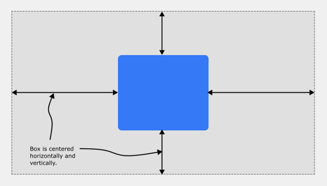
Figure Centering an element within its containing block requires just a few CSS declarations, but behind the scenes the browser is jumping through many mathematical hoops to get the job done
1.3.2 JavaScript’s built-in mathematical capabilities
- The Math object provides rounding, random number generation, min/max, absolute values, powers/roots, and trigonometry for angles and motion.
- Arithmetic operators (+, -, *, /, %, **) enable dynamic expressions for animation, layout logic, interactions, and visualizations.
- Because it runs in real time, JavaScript can adapt UI behavior instantly to user input and changing conditions.
1.3.3 Comparing CSS and JavaScript math approaches
CSS: Built-in, declarative math
Use CSS math (calc, min, max, clamp) to describe what you want for layout and typography; the browser computes results. It’s clean and responsive but not suited for loops, conditionals, or complex logic.
JavaScript: Dynamic, procedural math
Use JavaScript when you need to define how values change in real time with full logic, interactivity, and custom behavior.
When to use each
- CSS: Prefer for layout, sizing, spacing, and type that the browser can compute at render time.
- JavaScript: Prefer for interaction, animation, and complex, real-time adjustments.
In practice, combine both: CSS for design responsiveness and JavaScript for behavior and advanced dynamics.
1.4 The minimum math you need to know
This section outlines the small, practical set of math ideas that power everyday front-end work—layout, animation, interaction, and design logic. You don’t need advanced math; you need the right concepts and how to apply them with CSS and JavaScript.
Arithmetic and arithmetic expressions
- Use addition, subtraction, multiplication, and division to compute sizes, positions, and values.
- In CSS, calc() combines units and values; in JavaScript, expressions combine variables, constants, and operators.
- Operands are the inputs; operators (+, -, *, /) define the action.
Algebra
- Work with variables, constants, expressions, equations, inequalities, and functions to model relationships.
- Most UI math is algebraic: compute results from variable inputs (viewport sizes, scroll positions, time, user input).
- Common patterns: remaining height, responsive widths, grid math, motion formulas (position = start + speed × time).
Ratios
- Compare quantities (a:b or a/b) for proportion: aspect ratios, fractional grids, typographic scales, and scaling effects.
- Use aspect-ratio in CSS, percentages and fr units for layout, and ratio multipliers for responsive sizing.
Exponents and nth roots
- Exponents model growth/curves; roots invert powers (square root, cube root, etc.).
- Practical uses: distances via Pythagorean theorem, easing curves, and non-linear fades or speeds.
- Key tools: Math.pow(), Math.sqrt() in JavaScript; easing functions in CSS and JS.
Linear equations
- y = mx + b models constant-rate change (straight-line relationships).
- Typical uses: progress from scroll position, consistent motion (position = initial + speed × time), fluid sizes (vw with offsets).
- Think in slope (m), input (x), output (y), and starting value (b).
Inequalities and comparison expressions
- Compare values with >, <, >=, <=, ==, != to make decisions in logic and styling.
- CSS often implies comparisons (min-width means >=); JS uses explicit operators.
- Use cases: breakpoints, bounds (clamp()), validation, conditional behaviors.
Geometry
- Work with points, lines, vectors, and angles (degrees/radians) for positioning, drawing, transforms, and motion.
- Tasks include measuring positions, rotating/scaling elements, drawing shapes/paths (canvas/SVG), and hit testing.
Trigonometry
- Relate triangle sides and angles with sin, cos, tan; essential for circular motion and oscillations.
- Use cases: placing items on a circle, waves/bounce animations, rotations, and path-based motion.
- Compute circular coordinates: x = cx + r cos(θ), y = cy + r sin(θ).
Coordinate systems
- Viewport coordinates: origin at top-left (0,0), +x to the right, +y downward; units in px (vw/vh for scaling to viewport).
- Measure and position with getBoundingClientRect(), clientX/clientY, and viewport units for responsive sizing.
- Supports off-screen positioning (negative or beyond-viewport values) for transitions and effects.
Bottom line: master these lightweight tools—arithmetic, algebra, ratios, exponents/roots, linear models, comparisons, geometry, trig, and coordinates—to reason about UI, make responsive layouts, craft animations, and build interactive, adaptable interfaces with confidence.
 Math for Frontend Web Dev ebook for free