1 Web dev math fundamentals
This chapter introduces the idea that math is already embedded in everyday front-end work, even when designers and developers do not consciously think of it as mathematics. Relative units, responsive layouts, animation easing, element measurements, spacing, typography, and interaction logic all depend on calculations. The main argument is that learning a modest amount of practical math helps replace guesswork with precision, making layouts more reliable, animations smoother, interfaces more adaptable, and debugging easier.
The chapter explains how math appears differently in CSS and JavaScript. CSS uses declarative math through units, percentages, layout systems, transforms, easing curves, and functions such as calc(), clamp(), min(), and max(), letting the browser calculate values at render time. JavaScript provides more dynamic and procedural math through arithmetic operators, variables, the Math object, real-time measurements, user input, animation timing, and coordinate calculations. Together, CSS and JavaScript let developers combine design-driven calculations with interactive behavior.
The chapter also surveys the minimum math concepts useful for web development: arithmetic, algebra, ratios, exponents, roots, linear equations, inequalities, geometry, trigonometry, and coordinate systems. These ideas support common tasks such as calculating widths, scaling type, preserving aspect ratios, modeling motion, setting breakpoints, positioning elements, drawing on canvas, rotating shapes, building circular menus, and responding to mouse or scroll positions. The overall message is that front-end math is not advanced theory; it is a practical toolkit for creating clearer, more flexible, and more professional web experiences.
Why is the section heading so much bigger than the main heading? Math!
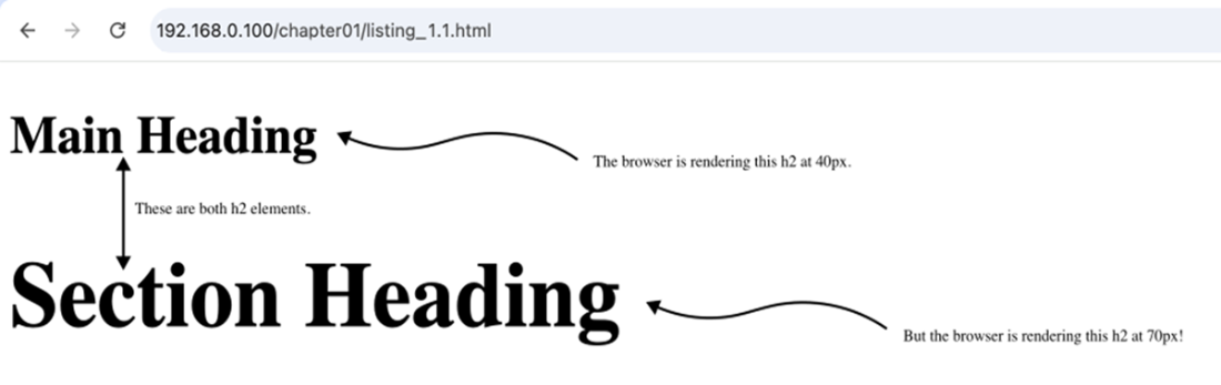
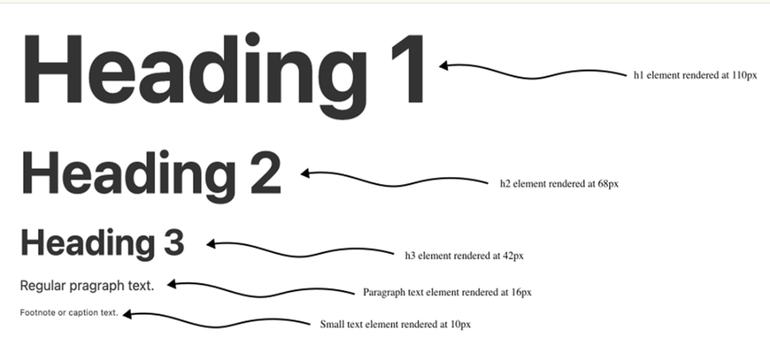
A type scale based on the Golden Ratio (approximately 1.618).
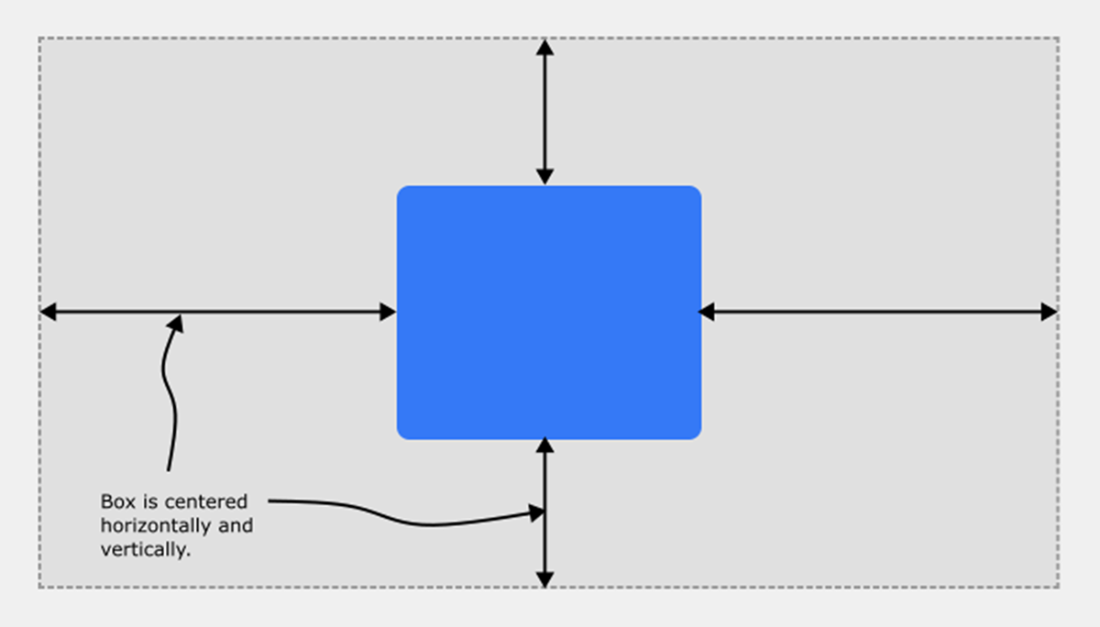
Centering an element within its containing block requires just a few CSS declarations, but behind the scenes the browser is jumping through many mathematical hoops to get the job done
Some basic geometric figures.

A right triangle and its sides relative to the angle theta (θ).

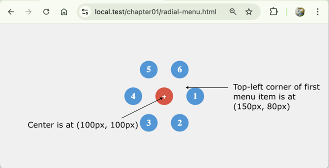
Using trigonometry to arrange menu items in a circle.
Summary
- Learning about front-end math will help you build more precise and reliable layouts, write more performant code, and debug layout issues faster.
- Mathematics in UI and UX design has practical use cases for responsive layouts, typography, colors, and spacing and alignment.
- Developers use math when coding motion and animation, layouts, and user interactions.
- In CSS, you use math to position and transform elements, scale layouts, build responsive elements, style text, and animate transitions.
- CSS provides math functions that you can use to perform basic arithmetic right in your style declarations.
- JavaScript gives you full control with dynamic, real-time math using the Math object and custom logic.
- Use CSS math for layout, sizing, spacing, and typography when the values can be determined by the browser at render time.
- Use JavaScript math when you need interaction, animation, or real-time adjustments based on user behavior or complex conditions.
FAQ
Why should front-end developers and designers learn web development math?
Learning web development math helps you build more precise, reliable layouts, master responsive design faster, write smarter code, debug layout and animation problems more easily, and unlock more creative design possibilities. The goal is not advanced theory; it is practical math that makes layouts, interfaces, animations, and interactions more robust.
Where does math show up in everyday web design work?
Math appears in many common front-end tasks, including spacing, alignment, sizing, typography, responsive breakpoints, animations, easing functions, scroll effects, and user interactions. Even tasks such as setting a max-width, centering an element, using em or rem, or calling getBoundingClientRect() involve mathematical calculations behind the scenes.
How does math help with responsive design?
Responsive design depends on scaling, proportions, and constraints. Math is used in percentages, viewport units such as vw and vh, and CSS functions such as calc(), clamp(), min(), and max(). Understanding these concepts helps you create fluid designs that adapt predictably to different screen sizes.
How does CSS use math?
CSS uses math to position elements, scale layouts, create responsive designs, style text, and animate transitions. For example, declarations such as left: 50%, transform: translate(-50%, -50%), width: calc(100% - 2rem), and font-size: clamp(1rem, 2vw, 2rem) all rely on browser calculations.
How is CSS math different from JavaScript math?
CSS math is mostly declarative: you describe what value you want, and the browser calculates it at render time. It is ideal for layout, sizing, spacing, and typography. JavaScript math is procedural and dynamic: you define how calculations happen, often in response to user input or changing conditions. JavaScript is better for complex logic, interaction, animation, real-time updates, and custom behavior.
What JavaScript math tools are most useful in front-end development?
JavaScript provides arithmetic operators such as +, -, *, /, %, and **, along with the built-in Math object. Useful methods include Math.round(), Math.floor(), Math.ceil(), Math.random(), Math.max(), Math.min(), Math.abs(), Math.pow(), Math.sqrt(), Math.sin(), Math.cos(), and Math.atan2().
What basic arithmetic concepts are needed for web development?
The most common arithmetic operations are addition, subtraction, multiplication, and division. These operations are used inside expressions to calculate values. An operand is an input value, such as a number, variable, or function result. An operator is the symbol that performs an action, such as + for addition or * for multiplication.
Why is algebra important in front-end development?
Algebra helps you work with variable values, constants, expressions, equations, inequalities, and functions. In front-end code, variable values often come from the browser environment, user behavior, CSS variables, JavaScript variables, or function results. For example, const remainingHeight = window.innerHeight - headerHeight; uses algebra to calculate available space based on changing values.
How are ratios used in web design?
Ratios compare quantities and are used for aspect ratios, typographic scales, grid proportions, Flexbox layouts, responsive scaling, and visual harmony. For example, a video thumbnail can maintain a 16:9 shape with aspect-ratio: 16 / 9;. Ratios can also define type scales, such as using the Golden Ratio, approximately 1.618, to create consistent visual rhythm.
What roles do geometry, trigonometry, and coordinate systems play in web development?
Geometry helps with points, lines, vectors, angles, shapes, rotations, scaling, collision detection, and canvas drawing. Trigonometry helps calculate circular layouts, radial menus, wave effects, rotation, and movement along curves using functions such as Math.sin() and Math.cos(). Coordinate systems help locate elements and pointer positions in the viewport, where the origin (0, 0) is usually the top-left corner, the x-axis extends right, and the y-axis extends downward.
 Math for Web Design ebook for free