5 Flexbox math
Flexbox can feel magical because elements stretch, shrink, and line up with just a few declarations, but the behavior is driven by precise math. This chapter opens the hood on that math so layouts become predictable and debuggable. It frames Flexbox as a one‑dimensional layout system governed by flex factors—flex-grow and flex-shrink—working from each item’s flex base size, then shows how the browser allocates or reclaims space along the main axis in response to underflow and overflow.
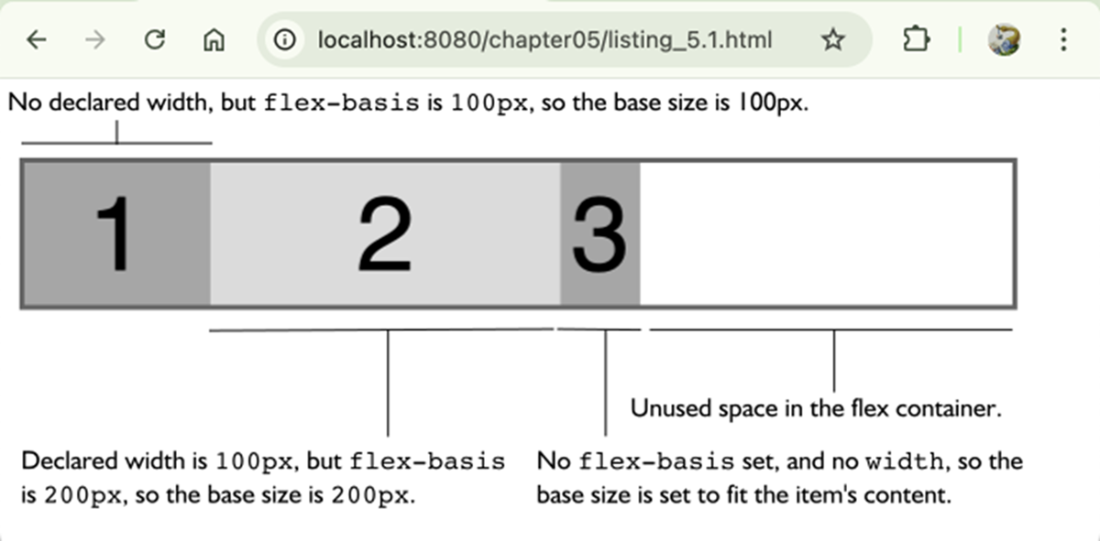
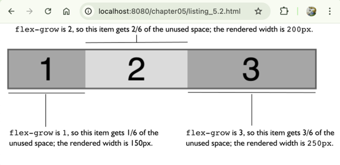
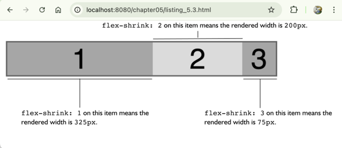
The browser starts by determining each item’s base size: a declared flex-basis wins; otherwise auto falls back to width, then to intrinsic content size. With those bases, it sums the initial sizes and compares to the container. If there’s free space, flex-grow distributes it proportionally to each item’s grow factor; if there’s overflow, flex-shrink resolves it using weighted shrink factors (base size multiplied by the shrink value), so items do not necessarily shrink equally. The chapter also explains the nuance of flex-grow values between 0 and 1: when their sum is at least 1 they behave as relative ratios; when the sum is less than 1 they act as direct percentages of free space, which can leave unused space behind.
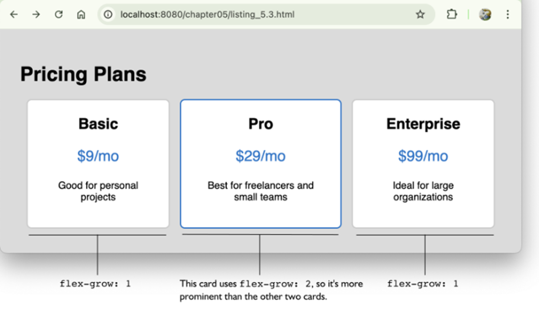
After growth or shrink math proposes new sizes, the engine enforces min/max constraints (min-width and max-width or their height counterparts), clamping items that would exceed limits and redistributing any remaining overflow/underflow across nonconstrained items according to their factors. The chapter rounds out with practical patterns—emphasizing a card by giving it a higher grow value, keeping icons fixed with flex: 0 0 auto, tuning shrink behavior with values below or above 1—and advocates using the flex shorthand to set grow, shrink, and basis together, being mindful of the implicit defaults it applies.
How the browser determines the flex base size.
How flex-grow works. Notice that there’s no longer any unused space in the container.
Using flex-grow to make a card more prominent.
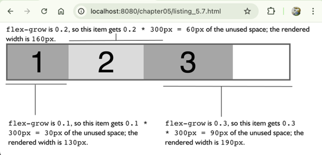
How flex-shrink works. Notice that there’s no longer any unused space in the container.
A flex-shrink example.
Item 1 has a flex-grow value of 0.5.
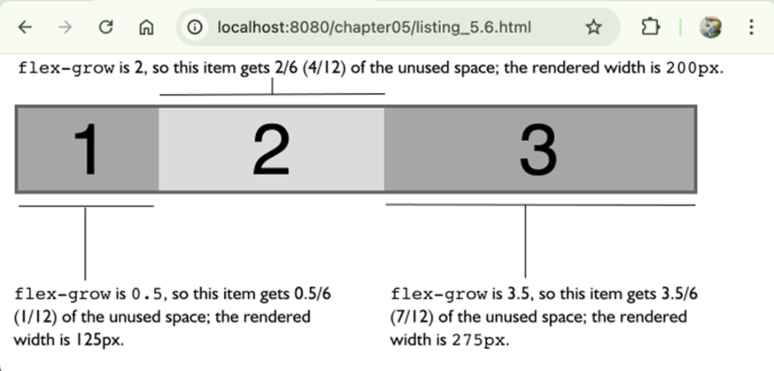
The total of the flex-grow factors is less than 1.
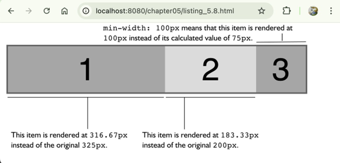
Setting min-width: 100px ensures that no item is rendered with a width smaller than that constraint.
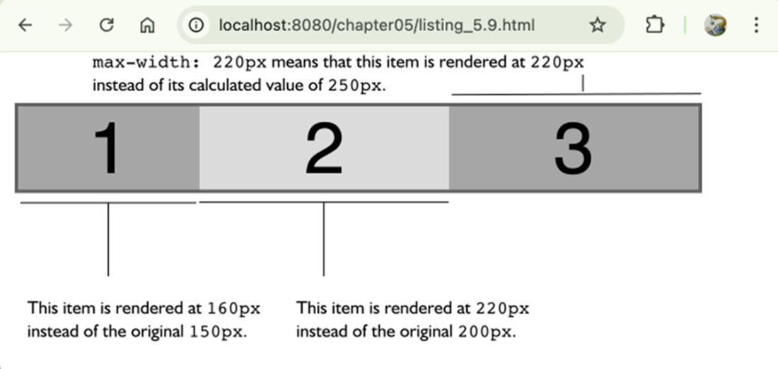
Setting max-width: 220px ensures that no item is rendered with a width greater than that constraint.
Summary
- The flex base size is the starting point for all flex calculations and is determined by flex-basis, or if that’s auto, by width or the item’s intrinsic size.
- When a flex container has extra space (underflow), the browser distributes it using each item’s flex-grow value as a proportion of the total grow factors.
- When a container doesn’t have enough space (overflow), the browser reduces each item’s size using a weighted formula based on the item’s width and flex-shrink value.
- The flex shorthand property sets all three flex properties (flex-grow, flex-shrink, and flex-basis) at once, and can override individual settings if not used carefully.
- When all flex-grow values are between 0 and 1 and their sum is less than 1, the browser interprets them as absolute percentages of the free space rather than relative ratios.
- Min/ max constraints (such as min-width and max-width for a horizontal main axis) act as hard limits during grow/shrink calculations, forcing the browser to redistribute space when an item hits its bounds.
 Math for Web Design ebook for free