6 The mathematics of responsive design
This chapter shows that responsive design is, at its core, a math problem. It frames responsiveness as adaptation—keeping text legible, images undistorted, and components usable across any viewport—by reasoning in ratios, percentages, and conditional logic. You’re encouraged to adopt a problem‑solver’s mindset: define relationships between elements, predict how they should change as screens grow or shrink, and express that behavior with formulas so layouts stretch, compress, and realign intelligently. While Grid and Flexbox provide a strong baseline of fluidity, you’ll often combine them with targeted rules to achieve accessible, performant, maintainable results from a single codebase.
The chapter demystifies media queries as simple comparisons (greater/less than or equal) and promotes modern range syntax for clearer, non‑overlapping breakpoints, along with practical tips on unit choice and debugging. It then builds proportional thinking with percentages—how they resolve horizontally and vertically, how nesting compounds, and how to mix relative and fixed values via calc()—culminating in a step‑by‑step conversion from fixed to liquid layouts using a straightforward percentage formula for widths and spacing. Viewport units expand this toolkit: classic vw/vh/vmin/vmax, logical vi/vb, and the newer sv*/lv*/dv* families that solve the longstanding mobile 100vh overflow issue and let you choose stable, maximum, or dynamically updated viewport references as needed.
Finally, the chapter focuses on fluidity through CSS math functions—calc(), min(), max(), clamp()—to produce smooth scaling instead of jumpy breakpoint switches. It shows how to derive linear relationships (slope‑intercept) and plug them into clamp() to set bounded, viewport‑responsive sizes for containers, margins, padding, and gaps. When CSS alone isn’t enough—complex conditional layouts, data‑driven sizing, or live interaction—JavaScript steps in to compute proportions at runtime (for example, allocating space by weights). The overarching takeaway: think in relationships and constraints, prefer fluid systems expressed with the right units and functions, and bring in JS only where dynamic logic exceeds CSS’s mathematical reach.
The fixed-width hero image looks good on a desktop.

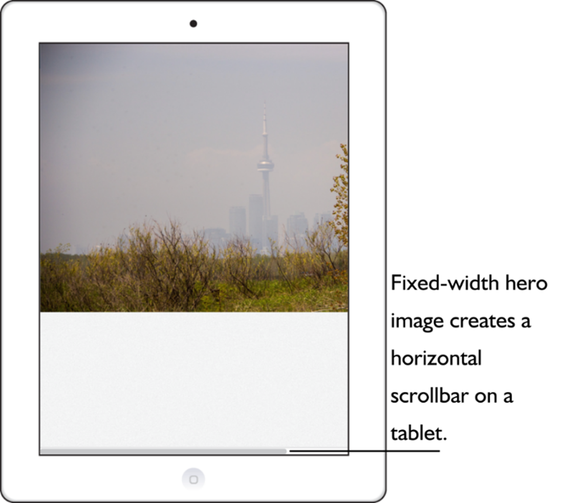
The fixed-width hero image requires a slight scroll on a tablet.
The fixed-width hero requires a huge horizontal scroll on a phone.
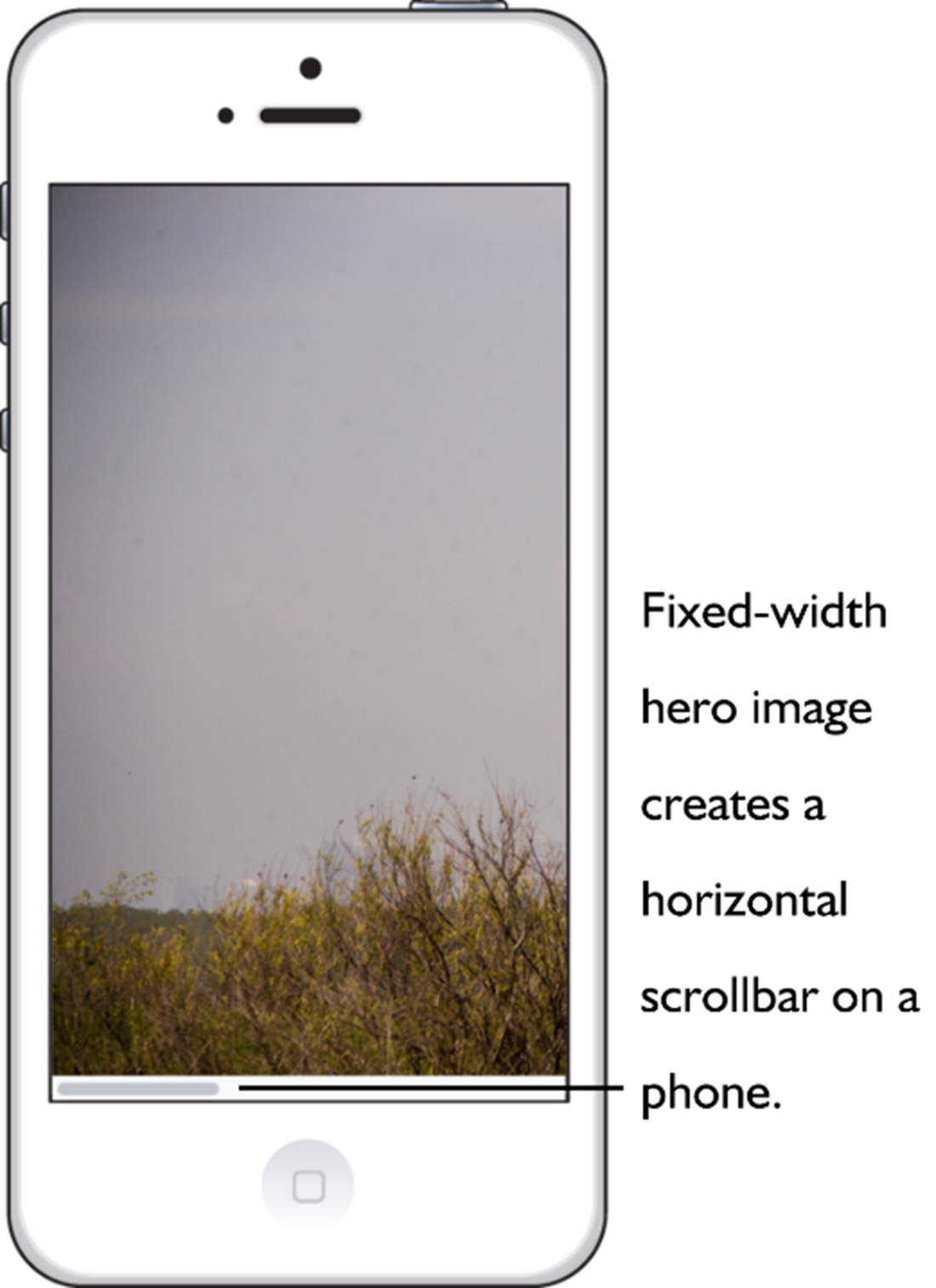
A fixed-width layout isn’t adaptable to different screen sizes.
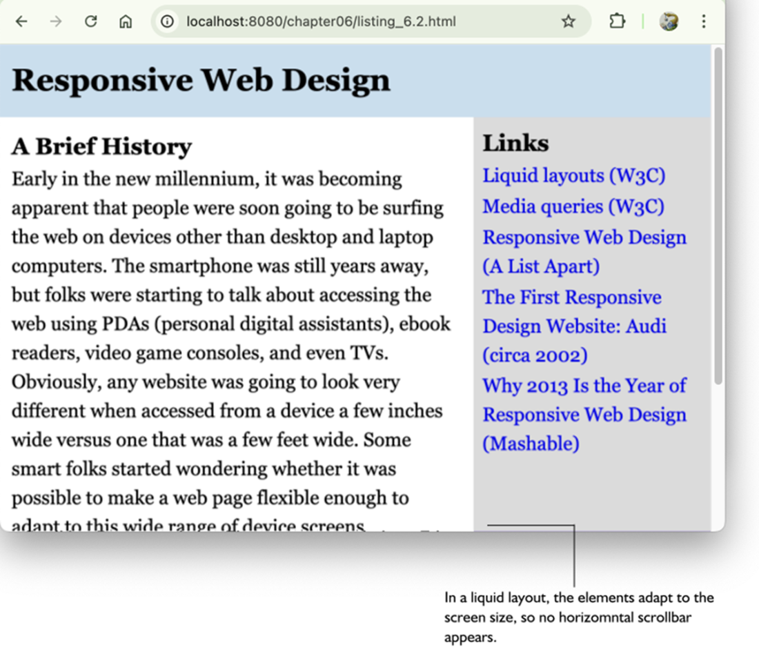
The same page from figure 6.4, now with a responsive liquid layout.
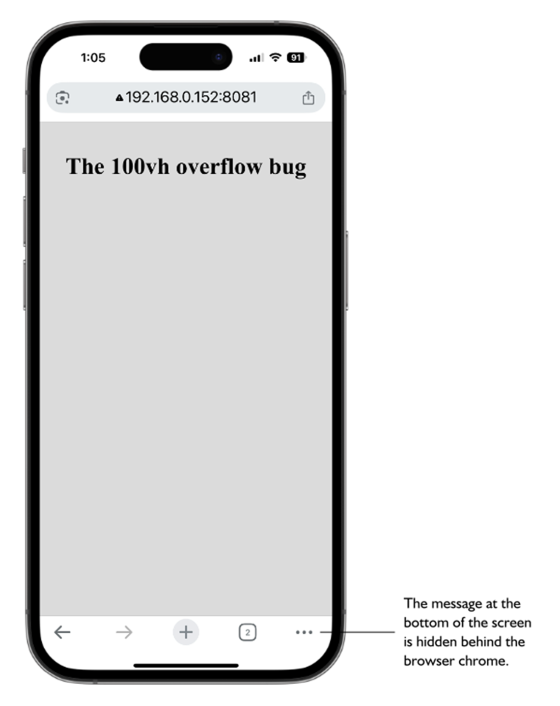
The 100vh overflow bug can cause important screen elements to be hidden behind the browser’s chrome.
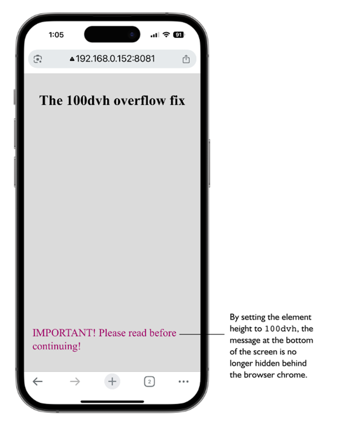
Setting the .fullscreen element’s height to 100dvh solves the overflow bug.
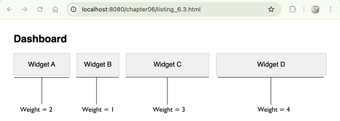
Dashboard widgets where the flex-basis was calculated dynamically via JavaScript.
Summary
- Responsive design is about adaptation, where a layout adapts itself to the current screen size and device features.
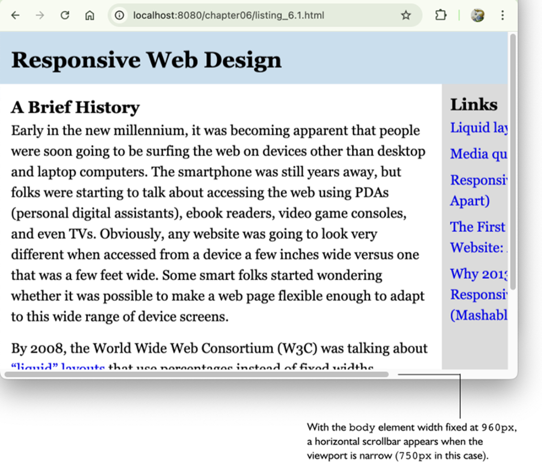
- Fixed-width layouts are almost always a problem on mobile devices because once the screen width is less than the fixed-size width, the user must scroll horizontally to read the page.
- Grid and Flexbox offer responsiveness right out of the box, but you might still need extra CSS properties to ensure your layout adapts properly to all screen sizes.
- The media query range syntax is well-supported and should be used unless you need to support legacy browsers.
- When using percentages, remember that with both horizontal properties such as width and padding-right and vertical properties such as margin-top and padding-bottom, the percentage is relative to the width of the parent.
- To create a liquid layout based on percentages, deciding a maximum width for your layout, determine the percentage widths to use for the rest of the elements, then apply the same formula to any other spacing-related items that are part of the layout, such as margins and padding.
- The standard viewport units vw and vh are fine in most cases, but consider using newer units such as svh and dvh if you want more control over your layouts.
- When using clamp(), you can calculate a length for the preferred value using the linear interpolation formula: (maxValue - minValue) / (maxVW - minVW) * 100.
FAQ
What does “responsive design” mean here, and how is math involved?
Responsive design is about adaptation: layouts must stay readable, scalable, and usable across screen sizes. The math shows up as ratios, percentages, proportions, and conditional logic—so elements relate to their parents (or the viewport) and rules change when conditions (like width) change.Do I always need media queries, or can Grid/Flexbox be enough?
Often Grid and Flexbox are enough because they’re inherently flexible (fr units, auto-fit/auto-fill, wrapping, grow/shrink). Use media queries when you must explicitly change the layout: switch column counts, adjust spacing at certain widths, reveal/hide nav, progressively enhance content, or reduce motion on small devices.How do media queries work mathematically, and what is range syntax?
Media queries are comparisons: min-width is “>=”, max-width is “<=”. Modern “range syntax” lets you combine conditions cleanly, for example:@media (600px <= width <= 1024px). It supports <, <=, >, >= for width/height and is widely supported; fall back to Boolean syntax (and, commas, not) for very old browsers.How do I pick breakpoints and avoid overlapping rules?
- Use consistent units (em or px). Using em ties breakpoints to font size for better accessibility. - Avoid overlaps such as both(max-width: 768px) and (min-width: 768px); split at 767/768 instead.
- Use devtools to see which queries activate while resizing.How do percentage-based layouts actually resolve in CSS?
- Horizontal properties (width, left/right padding/margins) resolve against the parent’s width. - Vertical padding/margins also resolve against the parent’s width (counterintuitive but true). - Percentage heights work only if the parent has an explicit height. - For absolutely positioned elements, percentages resolve against the containing block. - Nested percentages multiply; 80% parent and 50% child yields 40% of the outer.How do I convert a fixed layout to a liquid one?
Three steps: - Choose a sensible max width for readability (for example,max-width: 960px).
- Convert fixed widths to percentages using: percentage = (element width / parent width) × 100. Example: 640/960 = 66.67%.
- Convert spacing (padding/margins) similarly. This keeps proportions as the viewport changes.When should I use viewport units (vw, vh, vmin/vmax, vi/vb, svh/lvh/dvh) instead of %?
Use viewport units when sizing relative to the screen, not a parent. Classics:vw, vh, vmin, vmax. Logical variants: vi/vb are writing‑mode aware. New families:
- sv*: “small” viewport with browser UI visible (safe minimum).
- lv*: “large” viewport with UI hidden (like classic vh).
- dv*: dynamic, updates as UI appears/disappears. Helpful for filling the screen without overflow or gaps.What’s the 100vh mobile overflow bug, and how do I fix it?
On mobile,100vh can include browser UI, causing content to overflow or hide behind toolbars. Fix with:
- height: 100svh to fit the visible area on load (no initial overflow), or
- height: 100dvh to always match the current visible height as toolbars show/hide (may reflow on scroll).How do CSS functions (calc, min, max, clamp) make layouts fluid without many breakpoints?
- Usecalc() for linear relationships (e.g., calc(100% - 2rem)).
- Use min()/max() for caps/floors.
- Use clamp(min, preferred, max) to combine both. Example: width: clamp(300px, 90%, 1200px).
To compute a “preferred” vw for clamp between minValue and maxValue over minVW–maxVW:
preferred = ((maxValue − minValue) / (maxVW − minVW)) × 100vw.
Example: margin: clamp(1rem, 4vw, 3rem).When do I need JavaScript for responsive behavior?
Use JS when CSS can’t: - Complex conditional logic or DOM reordering. - Runtime calculations beyond CSS math (e.g., sizing based on live data). - Responding to interactions/data streams (charts, canvases). Example: compute proportional widths from weights and set each widget’sflex-basis so space is allocated dynamically.
 Math for Web Design ebook for free